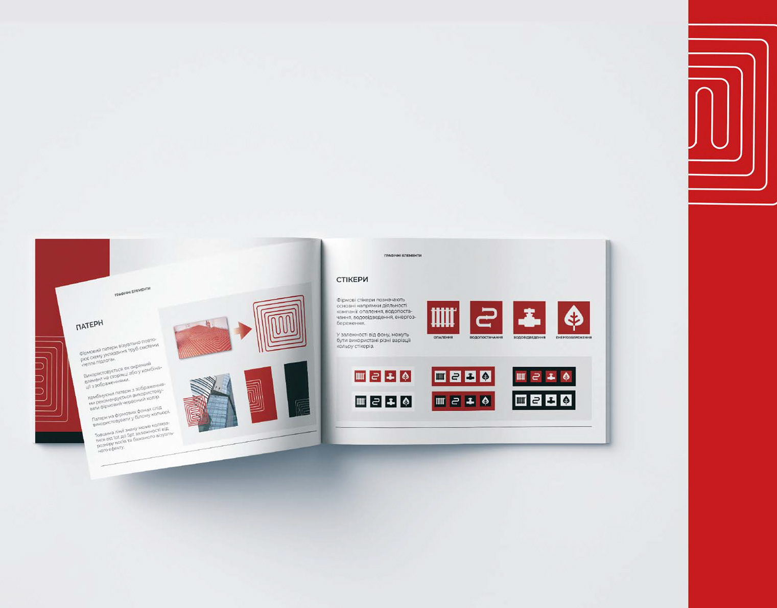
This visual identity was created for my design and print service "Polihrafichna Kramnytsia" (what means "Polygraphy Store" in Ukrainian). The brand specializes in working with design cardboards.

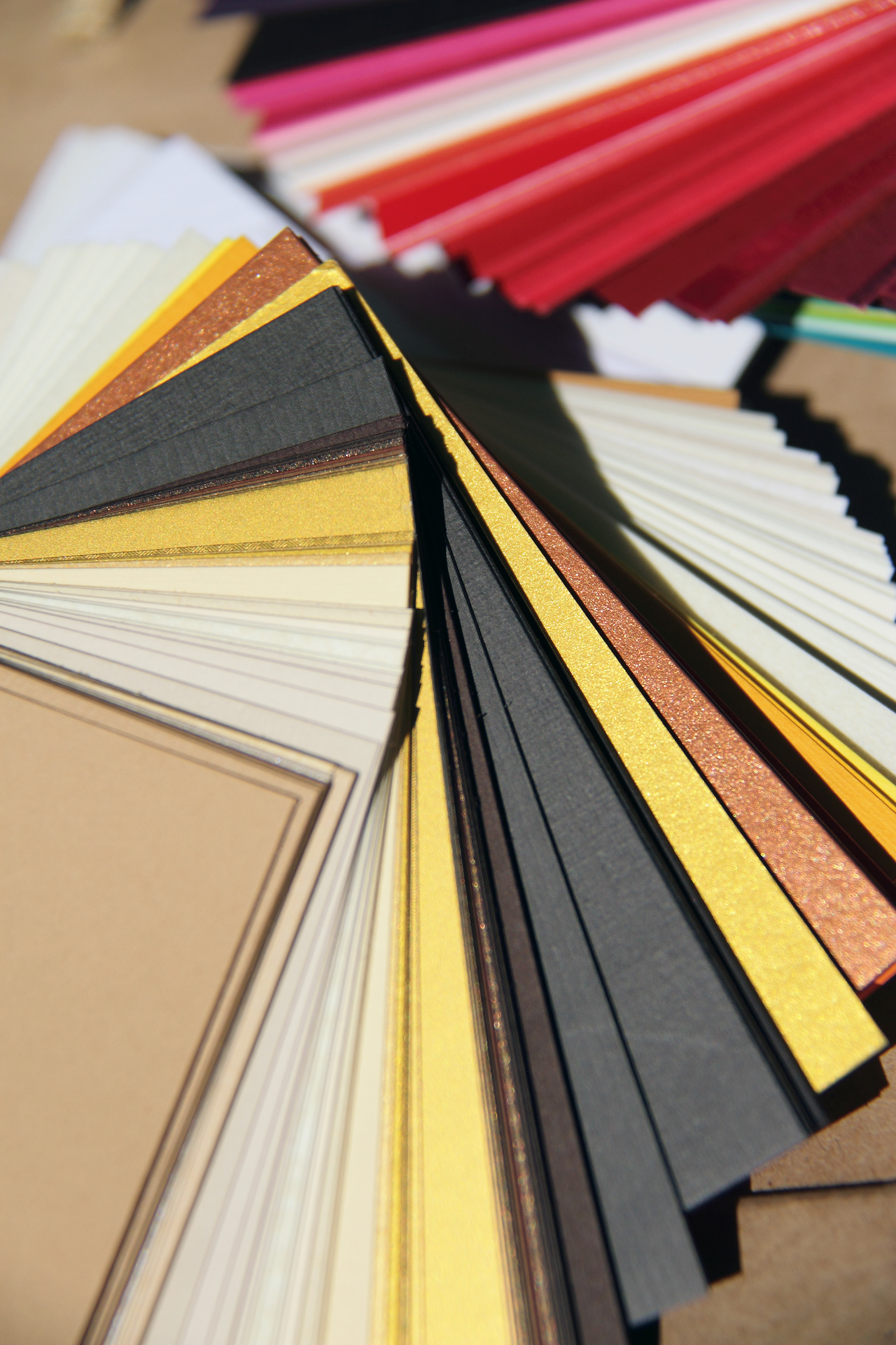
From the very beginning, two key elements were developed. The first was a geometric logo representing the brand's main service—print polygraphy. The second was product photography to highlight its core focus—working with design cardboard.

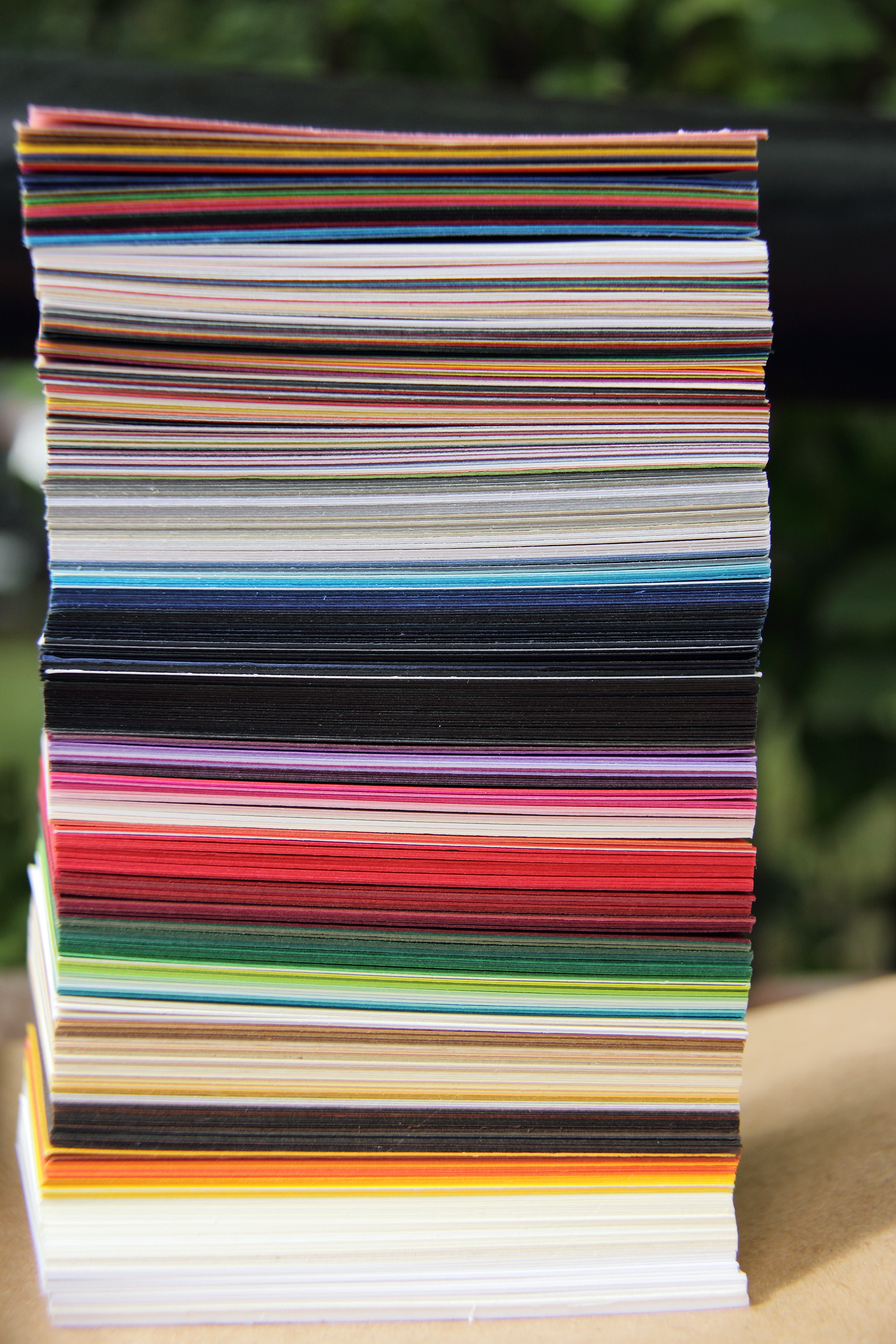
1: Shooting
That's me, looking forward to creating new photos of design cardboards. My sister—who is also the product photographer—is behind the camera this time (and took this shot).
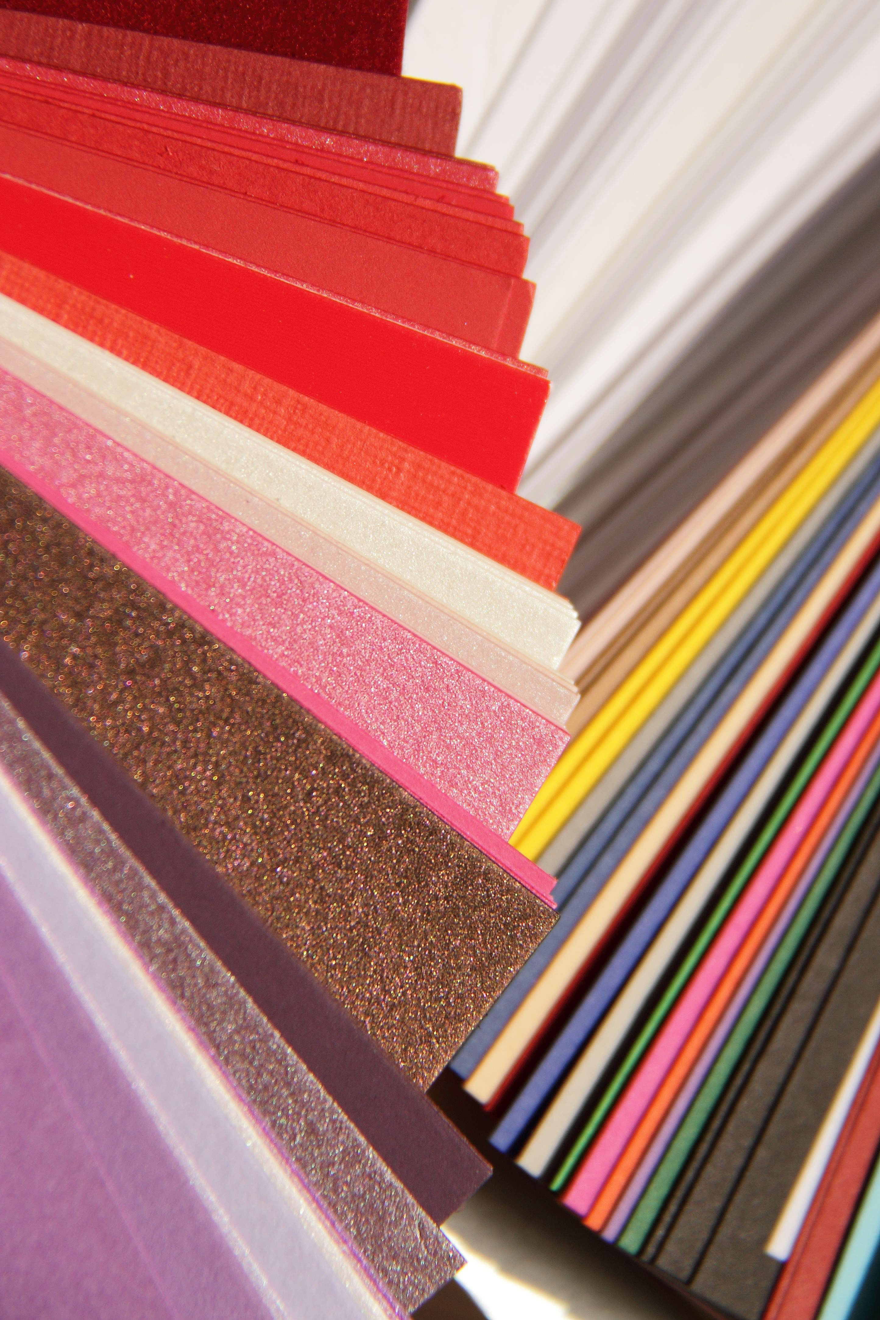
Some of the photos (mot mine, but of the design cardboards) from that shoot have already been featured on this website, either as part of the visual style project or in grids.



2: Logo geometry
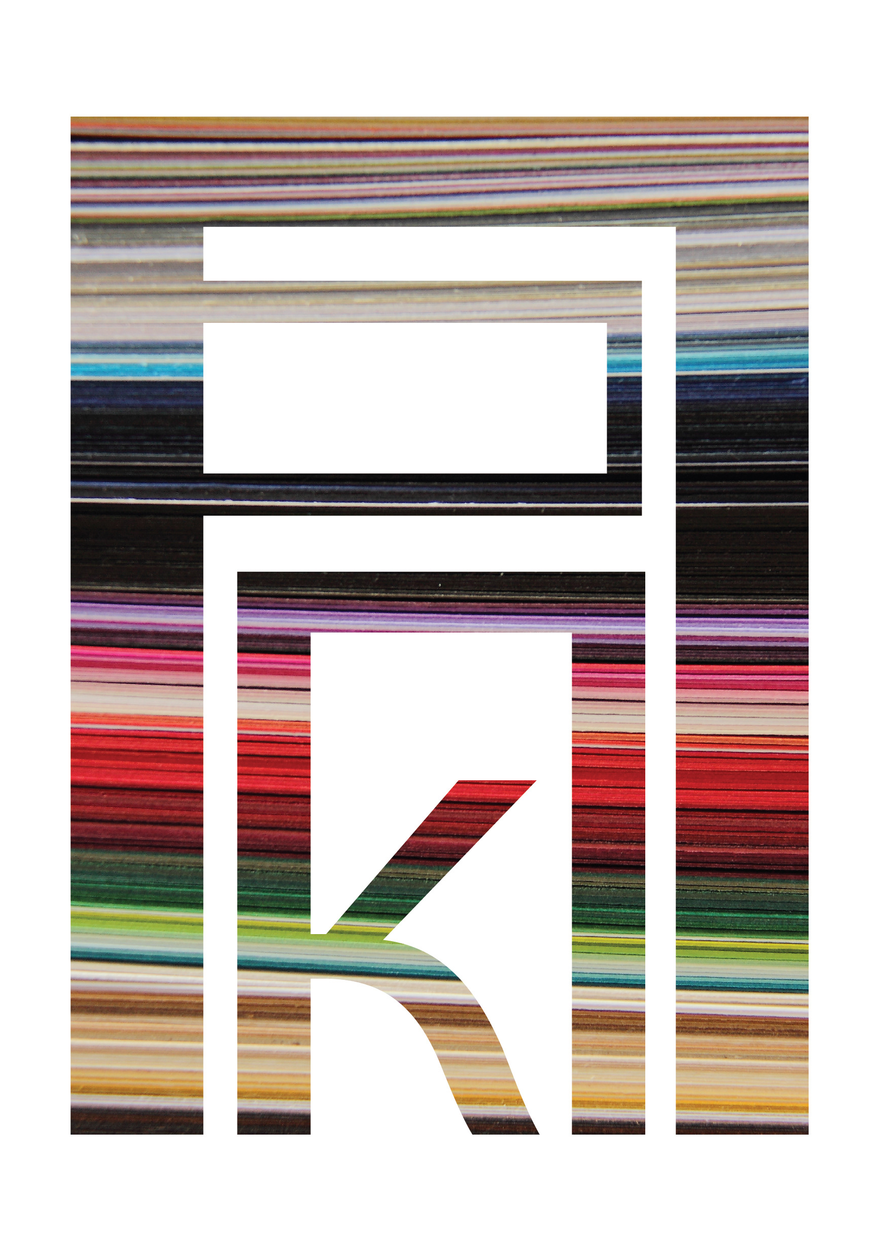
I designed a logo with the idea it could be used in both negative and positive space. it contains the letters "P" (Cyrillic "П") and "K", representing the first two letters of the trade mark name.
The design is also geometric enough to look good as a stamp at small sizes.
Next step: combining my logo with paper shots from our photo shooting. Voilà! Here is a bright and flexible sign.
3: Combined Logo



3: Branded Set


Here you see the final result - branded materials featuring the geometric logo, photos, and sometimes the logo as a stamp.
I designed business cards, postcards, notebooks, and leaflets to demonstrate how the identity works.
I also wrote small inspirational messages for those who may doubt their ability to find and design their own visual style.
...
to see my completed works on design papers, go here
Team:
Idea and Graphic Design: Anna Berezhna
Photos: BoaPhoto

